

During my second year studying design at SU, I was approached by two of my former Journalism 211 professors, Megan Craig and Edecio Martinez, who recently took over the Orange Television Network at Syracuse University. Orange Television Network is for students, by students; running original shows and syndicated content. One of the goals that Meg Craig had for the network was an overhaul of their branding, and a sleek, modernized logo system.
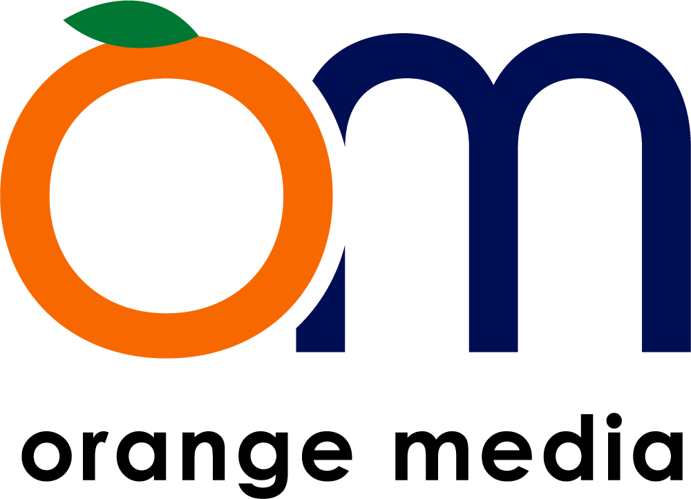
I began the project by researching known television networks with recognizable branding. I noticed many are simple monograms or initialisms with the name of the network, so this was the primary design goal. Initially, I was asked to create a new branding for “Orange Media”, which was intended to be a slightly more overarching parent brand of OTN. Therefore, my original round of designs incorporated an “OM” monogram, and an orange.
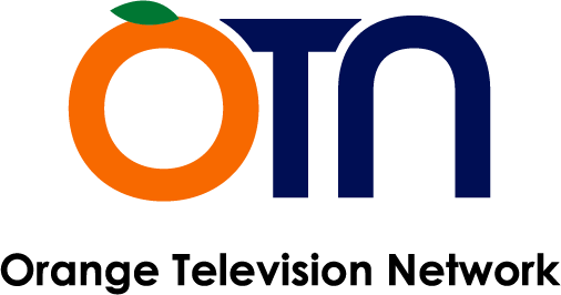
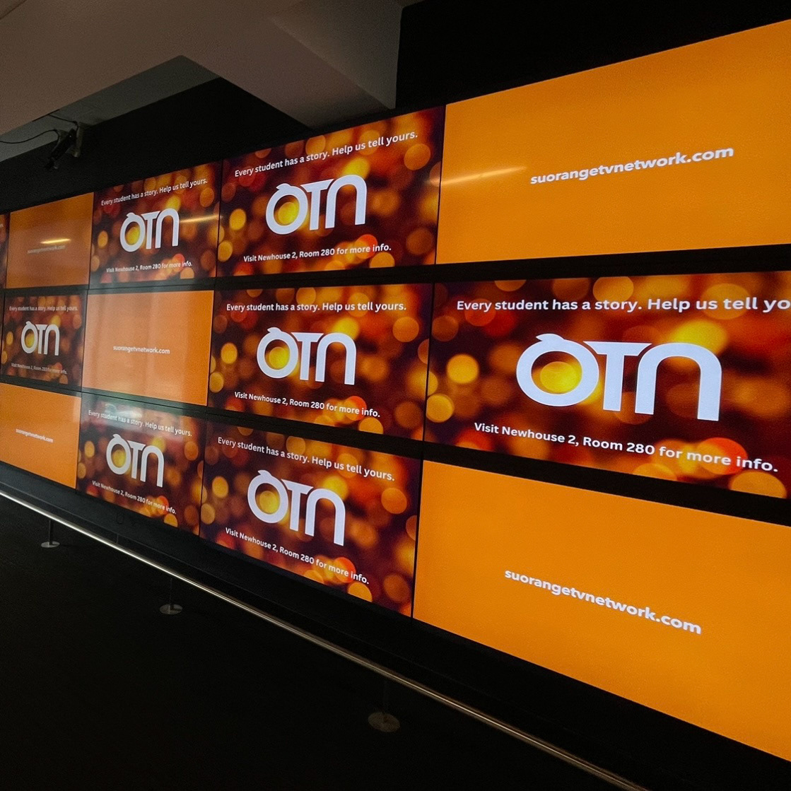
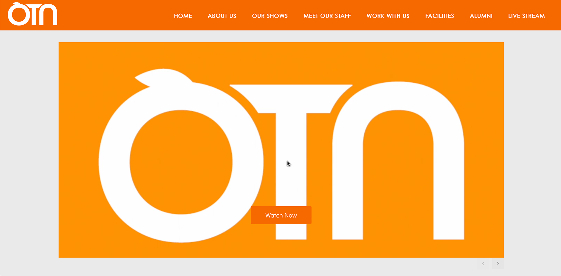
However, I was then told that they would prefer the logo to just be OTN as it originally was branded, but to use the same logo design and typography as my “OM” logo. This is how I created the OTN logo that is now currently used on all branding, online and in Newhouse.


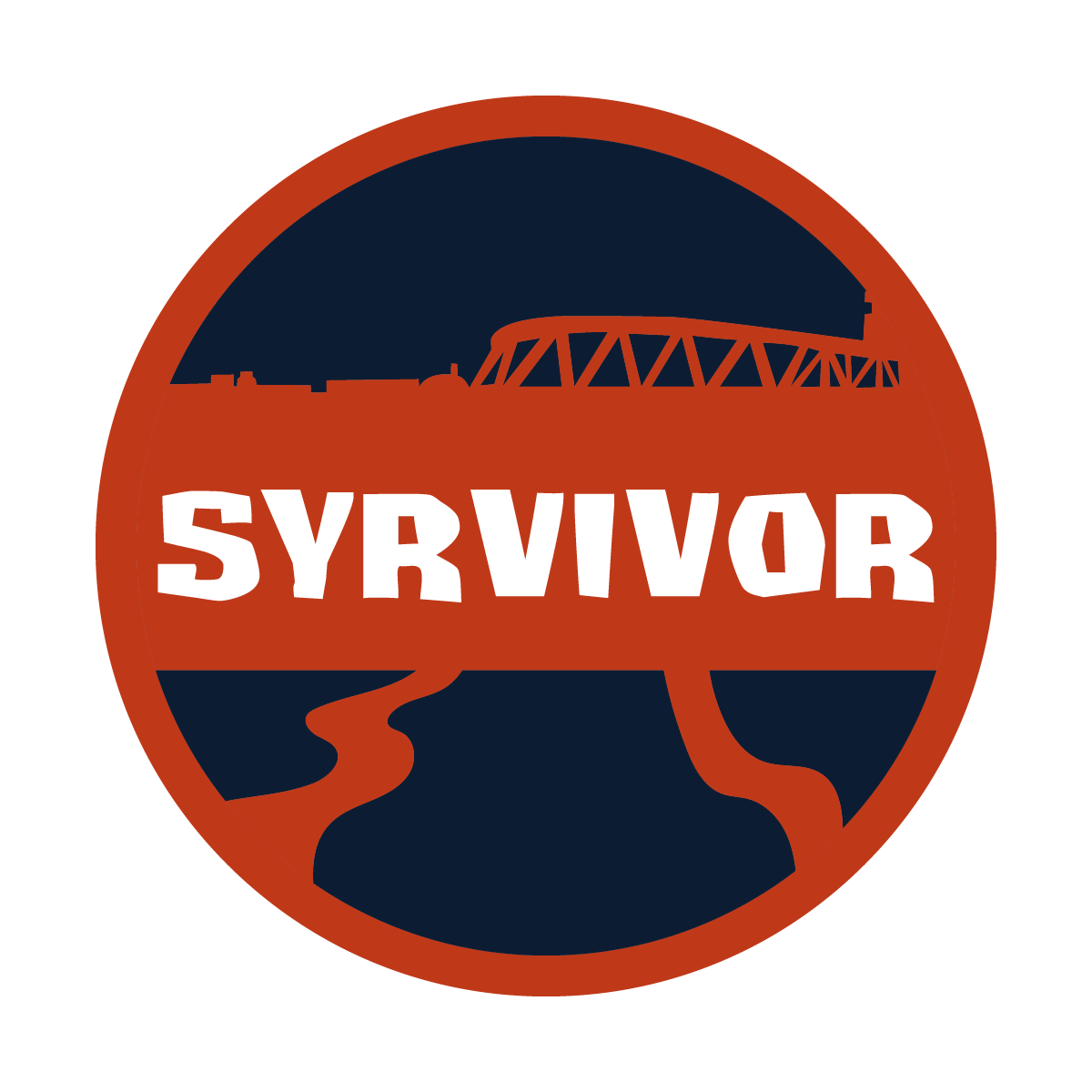
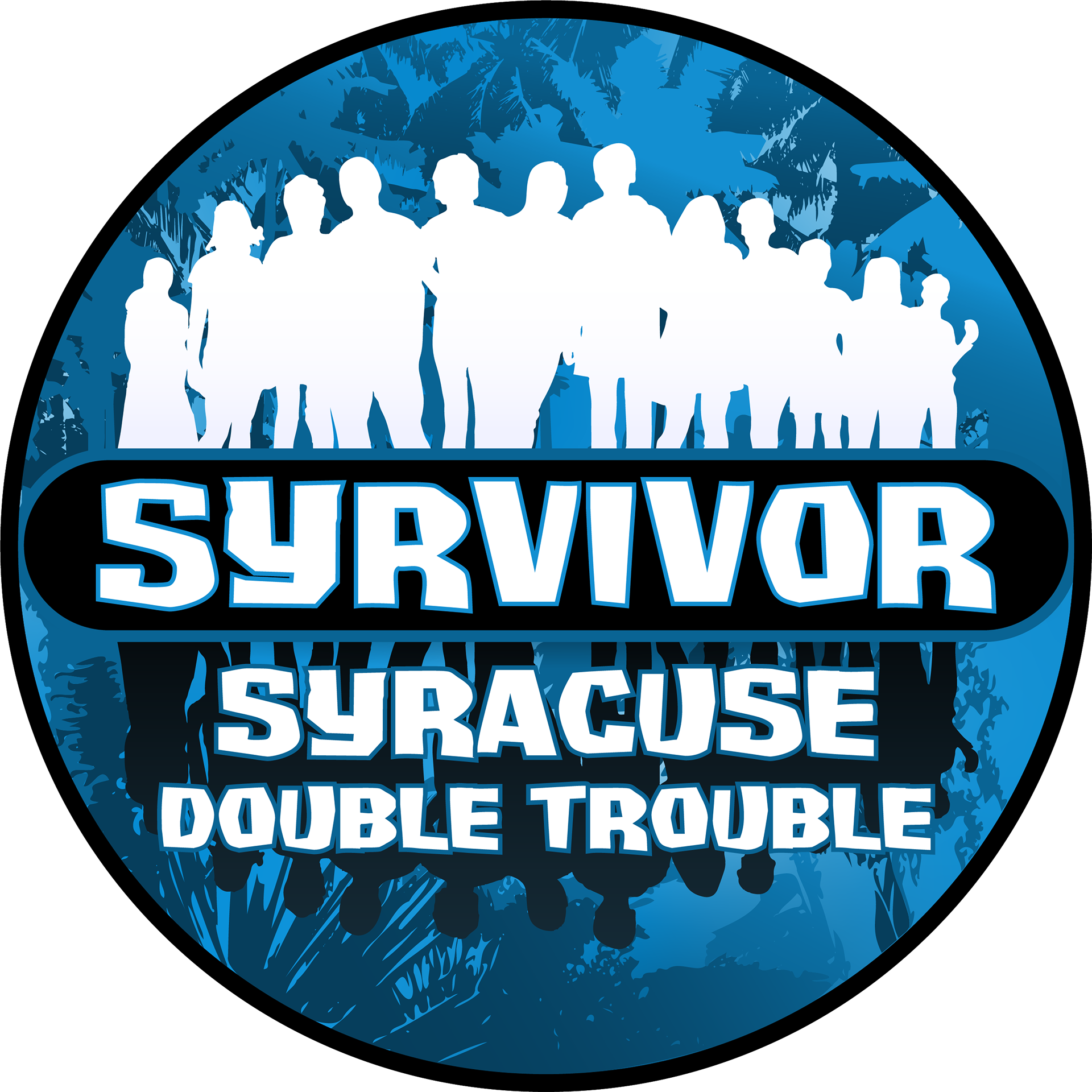
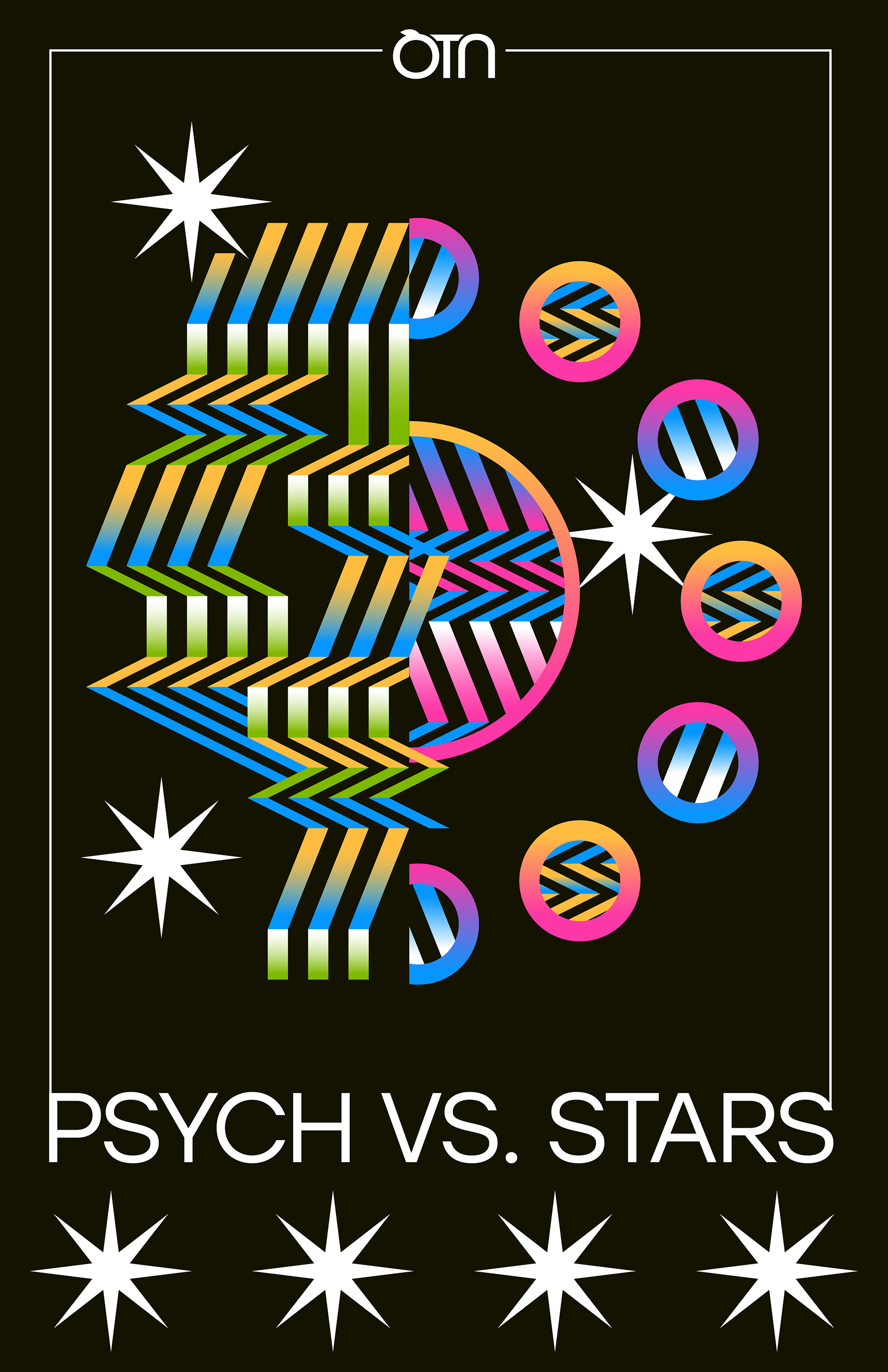
I continued to work for OTN over the next 2 years, designing various different show logos and other small design projects for the Network.


Overall, this project was one of my first true branding projects, and it was very rewarding to see the branding used in a place I actually frequented day-to-day. I have to thank Professors Craig and Martinez, because without this project, I doubt I would have realized my interest in brand design. This project truly pushed me and my design career forward.